A website’s homepage is one of its most important pages.
It’s where the vast majority of visitors will land when they first reach the website, and the website design, content and structure can dramatically influence what they do once they arrive.
So what are the characteristics of a homepage that’s so compelling people can’t help but learn more about you?
#1: It’s Informative.
Your homepage needs to quickly articulate who you are and what you offer to the viewer. If they can’t figure this out within 8 seconds, you probably won’t keep them on your site.

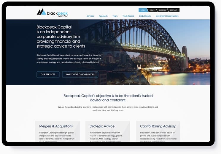
In the Blackpeak Capital example above the use of a clean logo, value proposition and introduction paragraph can help you accomplish this. Make sure all of those elements appear “above the fold” – that is, they should all be immediately visible to the viewer, without having to scroll down your page to see them.
#2: It’s specific to your target market.
The content on your homepage should be designed with your target market in mind. When writing copy for your homepage, consider your answers to questions like:
- What does my audience care about?
- What problems are they trying to solve?
- How does my business solve those problems better than anyone else?
- What concerns or objections are they likely to have?

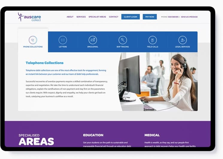
In the Kent Law Group example above, the process of creating great homepage content for their website (written by the team at Taleist Agency) started with a thorough understanding of who they were trying to reach. When you have that, you can craft compelling content that speaks to that customer’s unique needs and concerns, and maximise your chances of driving them to conversion, be it a sale, a quote request, or something else.
#3: It’s easy to navigate and actionable.
Another essential element of a well-designed homepage is that it’s easy to navigate. You can accomplish this by incorporating a few key design elements into your page.
- Use a clean website design. Excessive bells and whistles are reminiscent of the internet’s early days when more was better. Thankfully, that’s no longer true, and clean, streamlined website design is what will help viewers move through your page with ease.
- Have a clear call to action. Viewers want to be held by the hand when they arrive on a website. They want to know where they should go next, and what they should do when they get there.
- Make it easy to achieve that call to action. If you’re asking users to fill out a form, for example, place that form right on the homepage itself. Don’t expect people to click through a series of subpages to do what it is you’re asking of them.
- Use smaller blocks of text. Massive paragraphs that stretch down an entire computer screen are a complete turnoff for readers, and will almost surely drive them away from your site. Whenever possible, break text down into smaller paragraphs, with clear headers and bulleted lists where appropriate. These “snackable” blocks of text are easier for readers to digest, and will make them more likely to keep on browsing.
#4: It builds trust and addresses common concerns.
A great website homepage has enough high-value, specifically-relevant content to position you as a knowledgeable leader in your field. In this case, less is almost always more; it’s not about how much copy you have on your page. It’s about the quality of that copy. And it’s also about how that quality content is segmented into easy to read sections so that you enhance the user experience on your website.

Often, the barriers preventing would-be customers from taking action on your site tend to be consistent. If you know what these barriers are, consider creating an FAQ page to dispel these objections; you can seamlessly link to that page toward the end of your homepage. That way, someone who isn’t quite ready to take the action you clearly spelled out for them in step 3 still has a reason to remain on your site.
Conclusion
Once you feel you’ve got a good handle on these elements of excellent website design for the homepage, it’s time to test your work.
Use your web analytics tool of choice to measure whether you’ve made any improvements to metrics like bounce rate (the percentage of users that arrive on your website and then leave again without visiting another page), conversion rate and average pages per session on your site.
If you don’t see any movement in these numbers, then keep testing and tweaking – perhaps you need to try a different design, or maybe you need to revisit your original audience insight. Find out more about how we approach website design at Kicking Pixels
If you do see movement in these metrics though, then it’s likely that your homepage website design is starting to do its job. Congratulations!

